Dimensionality Reduction and Clustering#
In this tutorial, we explore the process of analyzing and clustering time-series data for power consumption of a radiator. We will leverage methods such as Principal Component Analysis (PCA) for dimensionality reduction and K-means & DBSCAN for clustering. Along the way, we will visualize the data using scatter plots.
Table of Contents#
Objectives#
This tutorial covers:
Loading and preprocessing time-series data.
Extracting features from the time-series data.
Performing dimensionality reduction using Principal Component Analysis (PCA).
Clustering data using K-means and DBSCAN.
Visualizing results of dimensionality reduction and clustering.
Import Required Libraries#
The libraries below are used for this tutorial:
[ ]:
import pandas as pd
from interpreTS.utils.data_validation import validate_time_series_data
from interpreTS.utils.data_conversion import convert_to_time_series
from interpreTS.core.feature_extractor import FeatureExtractor, Features
from sklearn.decomposition import PCA
from sklearn.preprocessing import StandardScaler
from sklearn.cluster import KMeans, DBSCAN
import matplotlib.pyplot as plt
import numpy as np
%matplotlib inline
Additionally, check the version of the interpreTS library:
[2]:
import interpreTS
print(f"interpreTS version: {interpreTS.__version__}")
interpreTS version: 0.5.0
Load and Preview the Data#
Load the data containing time-series data for power consumption from the provided CSV file.
[3]:
df = pd.read_csv('../data/radiator.csv')
Convert the timestamp column to datetime format and set it as the index:
[4]:
df['timestamp'] = pd.to_datetime(df['timestamp'])
df.set_index('timestamp', inplace=True)
Preview the dataset:
[5]:
display(df)
| power | |
|---|---|
| timestamp | |
| 2020-12-23 16:42:05+00:00 | 1.0 |
| 2020-12-23 16:42:06+00:00 | 1.0 |
| 2020-12-23 16:42:07+00:00 | 1.0 |
| 2020-12-23 16:42:08+00:00 | 2.5 |
| 2020-12-23 16:42:09+00:00 | 3.0 |
| ... | ... |
| 2021-01-22 16:42:01+00:00 | 1178.0 |
| 2021-01-22 16:42:02+00:00 | 1167.0 |
| 2021-01-22 16:42:03+00:00 | 1178.0 |
| 2021-01-22 16:42:04+00:00 | 1190.0 |
| 2021-01-22 16:42:05+00:00 | 1190.0 |
2592001 rows × 1 columns
Get information about the dataset:
[6]:
df.info()
<class 'pandas.core.frame.DataFrame'>
DatetimeIndex: 2592001 entries, 2020-12-23 16:42:05+00:00 to 2021-01-22 16:42:05+00:00
Data columns (total 1 columns):
 #   Column  Dtype
---  ------  -----
 0   power   float64
dtypes: float64(1)
memory usage: 39.6 MB
Validate and Convert the Data#
Ensure the dataset adheres to time-series data standards.
[7]:
try:
    validate_time_series_data(df)
    print("Time series data validation passed.")
except (TypeError, ValueError) as e:
    print(f"Validation error: {e}")
Time series data validation passed.
Transform the dataset into a TimeSeriesData object, suitable for interpreTS functions:
[8]:
time_series_data = convert_to_time_series(df)
Priview the converted TimeSeriesData object
[9]:
print(time_series_data)
display(time_series_data.data)
<interpreTS.core.time_series_data.TimeSeriesData object at 0x000001A8ACFD0770>
| power | |
|---|---|
| timestamp | |
| 2020-12-23 16:42:05+00:00 | 1.0 |
| 2020-12-23 16:42:06+00:00 | 1.0 |
| 2020-12-23 16:42:07+00:00 | 1.0 |
| 2020-12-23 16:42:08+00:00 | 2.5 |
| 2020-12-23 16:42:09+00:00 | 3.0 |
| ... | ... |
| 2021-01-22 16:42:01+00:00 | 1178.0 |
| 2021-01-22 16:42:02+00:00 | 1167.0 |
| 2021-01-22 16:42:03+00:00 | 1178.0 |
| 2021-01-22 16:42:04+00:00 | 1190.0 |
| 2021-01-22 16:42:05+00:00 | 1190.0 |
2592001 rows × 1 columns
Feature Extraction#
Initialize the FeatureExtractor to extract statistical and time-series features, such as mean, variance, and trend strength, using a sliding window approach with specified window_size and stride.
[10]:
extractor = FeatureExtractor(
    features=[
        Features.MEAN,
        Features.DOMINANT,
        Features.TREND_STRENGTH,
        Features.PEAK,
        Features.VARIANCE
    ],
    window_size="1min",
    stride="30s"
)
Extract features from the time series data.
[11]:
features = extractor.extract_features(time_series_data.data)
Display the extracted features.
[12]:
display(features)
| mean_power | dominant_power | trend_strength_power | peak_power | variance_power | |
|---|---|---|---|---|---|
| 0 | 601.708333 | 1.0 | 0.755769 | 1314.0 | 414014.519097 |
| 1 | 775.850000 | 1182.7 | 0.484017 | 1314.0 | 396195.760833 |
| 2 | 176.033333 | 1.0 | 0.355786 | 1303.0 | 191088.632222 |
| 3 | 380.816667 | 1.0 | 0.633966 | 1314.0 | 341707.616389 |
| 4 | 808.200000 | 1182.8 | 0.009364 | 1314.0 | 353516.293333 |
| ... | ... | ... | ... | ... | ... |
| 86394 | 901.433333 | 1090.9 | 0.004244 | 1212.0 | 246873.478889 |
| 86395 | 1003.950000 | 1090.9 | 0.407723 | 1212.0 | 186048.780833 |
| 86396 | 1193.233333 | 1189.5 | 0.002166 | 1201.0 | 43.512222 |
| 86397 | 828.750000 | 1081.0 | 0.217282 | 1201.0 | 247346.620833 |
| 86398 | 821.283333 | 1081.0 | 0.626586 | 1201.0 | 241983.030139 |
86399 rows × 5 columns
Standardize the Features#
Standardization ensures that all features have a mean of 0 and a standard deviation of 1, making them suitable for PCA and clustering.
[13]:
scaler = StandardScaler()
features_scaled = scaler.fit_transform(features)
PCA for Dimensionality Reduction#
Determine the Number of Components#
Perform PCA with all components.
[14]:
pca = PCA()
pca_result = pca.fit_transform(features_scaled)
Calculate the cumulative explained variance ratio.
[15]:
explained_variance_ratio = np.cumsum(pca.explained_variance_ratio_)
Plot the Scree Plot:
[16]:
plt.figure(figsize=(10, 6))
plt.plot(range(1, len(explained_variance_ratio) + 1), explained_variance_ratio, marker='o', linestyle='--')
plt.axhline(y=0.9, color='r', linestyle='--', label='90% Variance')
plt.title("Scree Plot - Cumulative Explained Variance")
plt.xlabel("Number of Components")
plt.ylabel("Cumulative Explained Variance")
plt.legend()
plt.grid()
plt.show()
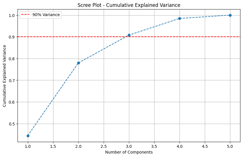
Determine the number of components required to explain at least 90% of the variance.
[17]:
n_components_90 = np.argmax(explained_variance_ratio >= 0.9) + 1
print(f"Number of components explaining at least 90% variance: {n_components_90}")
Number of components explaining at least 90% variance: 3
Apply PCA with Optimal Components#
Applies PCA to reduce the feature dimensions while retaining the maximum amount of information. Perform PCA with the optimal number of components.
[18]:
pca_final = PCA(n_components=n_components_90)
pca_final_result = pca_final.fit_transform(features_scaled)
Get the PCA loadings (coefficients)
[19]:
loadings = pca_final.components_
loading_df = pd.DataFrame(
    loadings.T,
    columns=[f"PC{i+1}" for i in range(n_components_90)],
    index=features.columns
)
To interpret the results of PCA, we display the PCA loadings. These loadings show how each feature contributes to the principal components.
[20]:
display(loading_df)
| PC1 | PC2 | PC3 | |
|---|---|---|---|
| mean_power | -0.629927 | 0.181104 | 0.174236 |
| dominant_power | -0.597785 | 0.165984 | 0.157005 |
| trend_strength_power | 0.008113 | -0.590912 | 0.800670 |
| peak_power | -0.492595 | -0.366028 | -0.351975 |
| variance_power | -0.055940 | -0.675646 | -0.424303 |
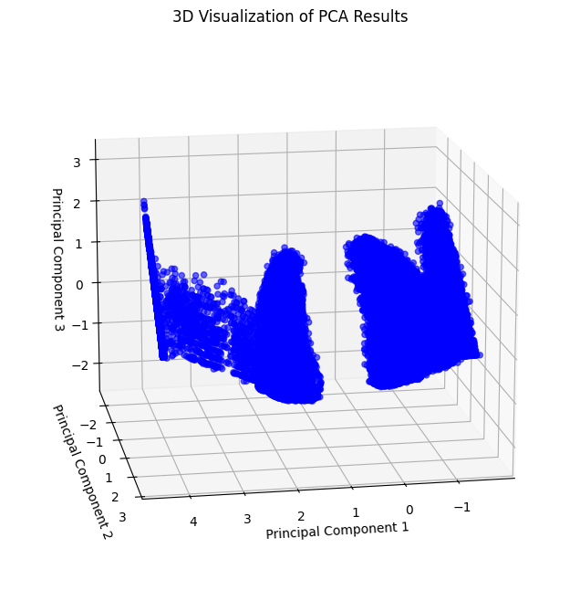
Visualize the results in 3D to observe how data separates into clusters:
[21]:
pca_df = pd.DataFrame(
    pca_final_result[:, :3],
    columns=["PC1", "PC2", "PC3"]
)

x = pca_df["PC1"]
y = pca_df["PC2"]
z = pca_df["PC3"]

fig = plt.figure(figsize=(10, 8))
ax = fig.add_subplot(111, projection='3d')
scatter = ax.scatter(x, y, z, c='blue', alpha=0.6)
ax.set_title("3D Visualization of PCA Results")
ax.set_xlabel("Principal Component 1")
ax.set_ylabel("Principal Component 2")
ax.set_zlabel("Principal Component 3")
ax.view_init(elev=15, azim=80)
plt.show()
The following visualization provides a different perspective of the 3D PCA scatter plot.
[22]:
fig = plt.figure(figsize=(10, 8))
ax = fig.add_subplot(111, projection='3d')
scatter = ax.scatter(x, y, z, c='blue', alpha=0.6)
ax.set_title("3D Visualization of PCA Results")
ax.set_xlabel("Principal Component 1")
ax.set_ylabel("Principal Component 2")
ax.set_zlabel("Principal Component 3")
ax.view_init(elev=55, azim=70)
plt.show()
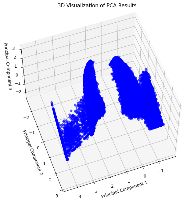
Observation: The 3D PCA scatter plot reveals distinct groupings, suggesting the potential for clustering.
K-means Clustering#
Determine the Optimal Number of Clusters#
Use the Elbow Method to find the optimal number of clusters
[23]:
inertia = []
cluster_range = range(2, 6)  # Range of clusters to try

for k in cluster_range:
    kmeans = KMeans(n_clusters=k, random_state=42)
    kmeans.fit(pca_final_result)
    inertia.append(kmeans.inertia_)
Plot the Elbow Method
[24]:
plt.figure(figsize=(10, 6))
plt.plot(cluster_range, inertia, 'bo-', label='Inertia')
plt.title("Elbow Method - Optimal Number of Clusters")
plt.xlabel("Number of Clusters (k)")
plt.ylabel("Inertia")
plt.legend()
plt.grid()
plt.show()
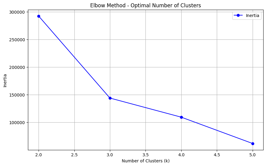
Interpretation: The “elbow” of the plot indicates the optimal number of clusters. For this data, the elbow occurs at k=3, suggesting three clusters.
Apply K-means with Optimal Clusters#
Based on the Elbow Method, K-Means is applied with k=3. Additionally, we experiment with a custom number of clusters (k=2) for comparison.
[25]:
optimal_k = 3
kmeans = KMeans(n_clusters=optimal_k, random_state=42)
kmeans.fit(pca_final_result)
[25]:
KMeans(n_clusters=3, random_state=42)In a Jupyter environment, please rerun this cell to show the HTML representation or trust the notebook.
On GitHub, the HTML representation is unable to render, please try loading this page with nbviewer.org.
KMeans(n_clusters=3, random_state=42)
[26]:
custom_k = 2
kmeans2 = KMeans(n_clusters=custom_k, random_state=42)
kmeans2.fit(pca_final_result)
[26]:
KMeans(n_clusters=2, random_state=42)In a Jupyter environment, please rerun this cell to show the HTML representation or trust the notebook.
On GitHub, the HTML representation is unable to render, please try loading this page with nbviewer.org.
KMeans(n_clusters=2, random_state=42)
K-means clustering labels
[27]:
clusters = kmeans.labels_
[28]:
clusters2 = kmeans2.labels_
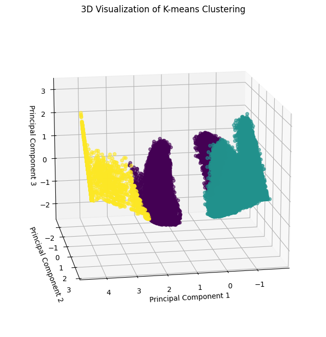
Visualize K-means Clustering#
Visualizes clustering results in 3D space because PCA reduced the number of columns to 3.
Visualization for k=3:
[29]:
pca_df = pd.DataFrame(
    pca_final_result[:, :3],
    columns=["PC1", "PC2", "PC3"]
)

x, y, z = pca_df["PC1"], pca_df["PC2"], pca_df["PC3"]
fig = plt.figure(figsize=(10, 8))
ax = fig.add_subplot(111, projection='3d')
scatter = ax.scatter(x, y, z, c=clusters, cmap='viridis', alpha=0.6)
ax.set_title("3D Visualization of K-means Clustering")
ax.set_xlabel("Principal Component 1")
ax.set_ylabel("Principal Component 2")
ax.set_zlabel("Principal Component 3")
ax.view_init(elev=15, azim=80)
plt.show()
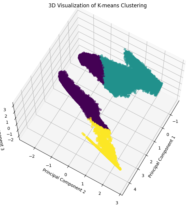
Alternative Perspective:
[30]:
x, y, z = pca_df["PC1"], pca_df["PC2"], pca_df["PC3"]
fig = plt.figure(figsize=(10, 8))
ax = fig.add_subplot(111, projection='3d')
scatter = ax.scatter(x, y, z, c=clusters, cmap='viridis', alpha=0.6)
ax.set_title("3D Visualization of K-means Clustering")
ax.set_xlabel("Principal Component 1")
ax.set_ylabel("Principal Component 2")
ax.set_zlabel("Principal Component 3")
ax.view_init(elev=65, azim=30)
plt.show()
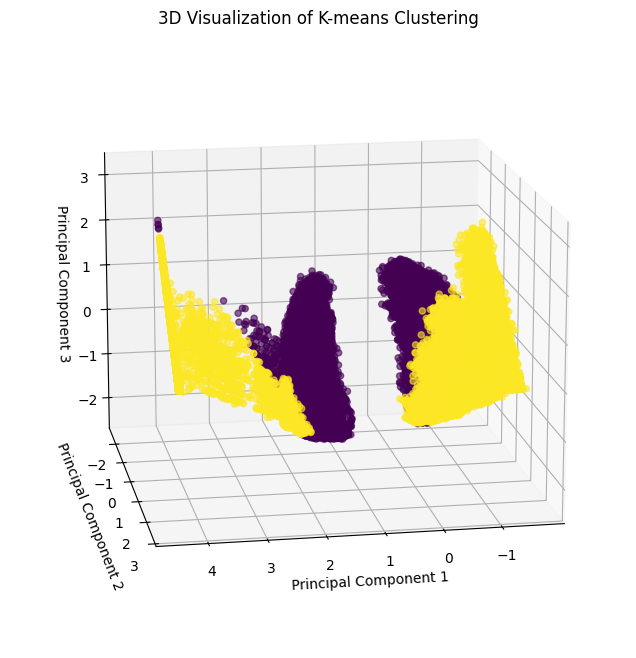
Visualization for k=2:
[31]:
pca_df = pd.DataFrame(
    pca_final_result[:, :3],
    columns=["PC1", "PC2", "PC3"]
)

x, y, z = pca_df["PC1"], pca_df["PC2"], pca_df["PC3"]
fig = plt.figure(figsize=(10, 8))
ax = fig.add_subplot(111, projection='3d')
scatter = ax.scatter(x, y, z, c=clusters2, cmap='viridis', alpha=0.6)
ax.set_title("3D Visualization of K-means Clustering")
ax.set_xlabel("Principal Component 1")
ax.set_ylabel("Principal Component 2")
ax.set_zlabel("Principal Component 3")
ax.view_init(elev=15, azim=80)
plt.show()
Alternative Perspective:
[32]:
x, y, z = pca_df["PC1"], pca_df["PC2"], pca_df["PC3"]
fig = plt.figure(figsize=(10, 8))
ax = fig.add_subplot(111, projection='3d')
scatter = ax.scatter(x, y, z, c=clusters2, cmap='viridis', alpha=0.6)
ax.set_title("3D Visualization of K-means Clustering")
ax.set_xlabel("Principal Component 1")
ax.set_ylabel("Principal Component 2")
ax.set_zlabel("Principal Component 3")
ax.view_init(elev=65, azim=30)
plt.show()

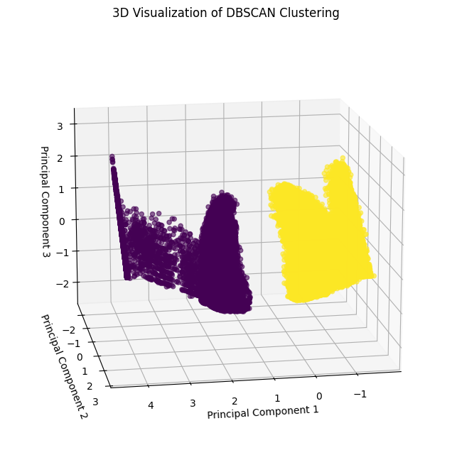
DBSCAN Clustering#
Apply DBSCAN#
DBSCAN clustering is applied to the data. This algorithm groups points based on density and handles non-linear clusters well. The parameters eps (maximum distance between points) and min_samples (minimum points in a neighborhood) require tuning for optimal performance.
[33]:
dbscan = DBSCAN(eps=0.5, min_samples=15)
dbscan_labels = dbscan.fit_predict(pca_final_result)
Visualize DBSCAN clustering#
The clustering results are visualized in 3D space using the three principal components.
[34]:
x, y, z = pca_final_result[:, 0], pca_final_result[:, 1], pca_final_result[:, 2]
fig = plt.figure(figsize=(10, 8))
ax = fig.add_subplot(111, projection='3d')
scatter = ax.scatter(x, y, z, c=dbscan_labels, cmap='viridis', alpha=0.6)
ax.set_title("3D Visualization of DBSCAN Clustering")
ax.set_xlabel("Principal Component 1")
ax.set_ylabel("Principal Component 2")
ax.set_zlabel("Principal Component 3")
ax.view_init(elev=15, azim=80)
plt.show()
Conclusion#
K-Means: Identifies global clusters but may struggle with non-linear shapes.
DBSCAN: Handles non-linear clusters and noise effectively but requires parameter tuning.
PCA proved valuable for visualization and clustering.
This analysis illustrates the power of interpreTS in feature extraction and clustering for time-series data.